
Rethinking Color of the Year
Every year, there is a lot of conversation about the color of the year. This year, Pantone’s official pick landed on, well, white. Pantone describes Cloud Dancer as “a lofty white whose aerated presence acts as a whisper of calm and peace in a noisy world.” It feels less like a point of view and more like a placeholder.
Color, like style, is cyclical. And right now, the pull is away from blankness and toward spaces with warmth, character, and personality.
For me, that color is dusty, muted rose.
Max Rollitt
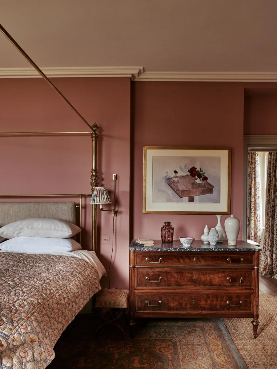
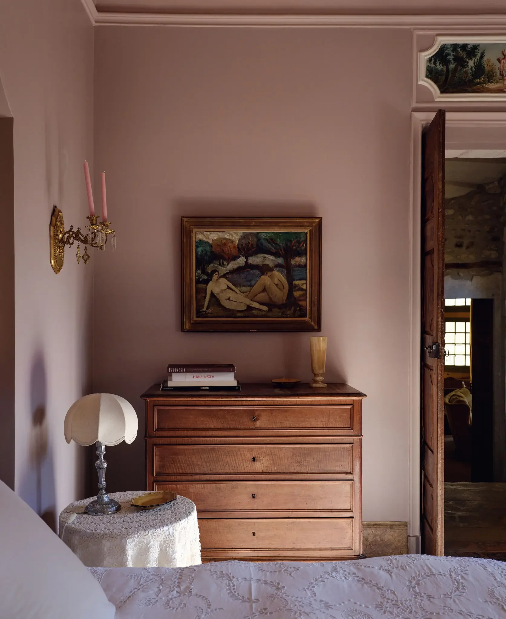
I have been obsessed with interiors using a dusty, muted rose on the walls. From bedrooms to bathroom to kitchens, I love how this rich pink feels historic, warm and modern at the same time. The rich color gives off warmth without being too sweet, and feels bold without coming off as overly trendy.
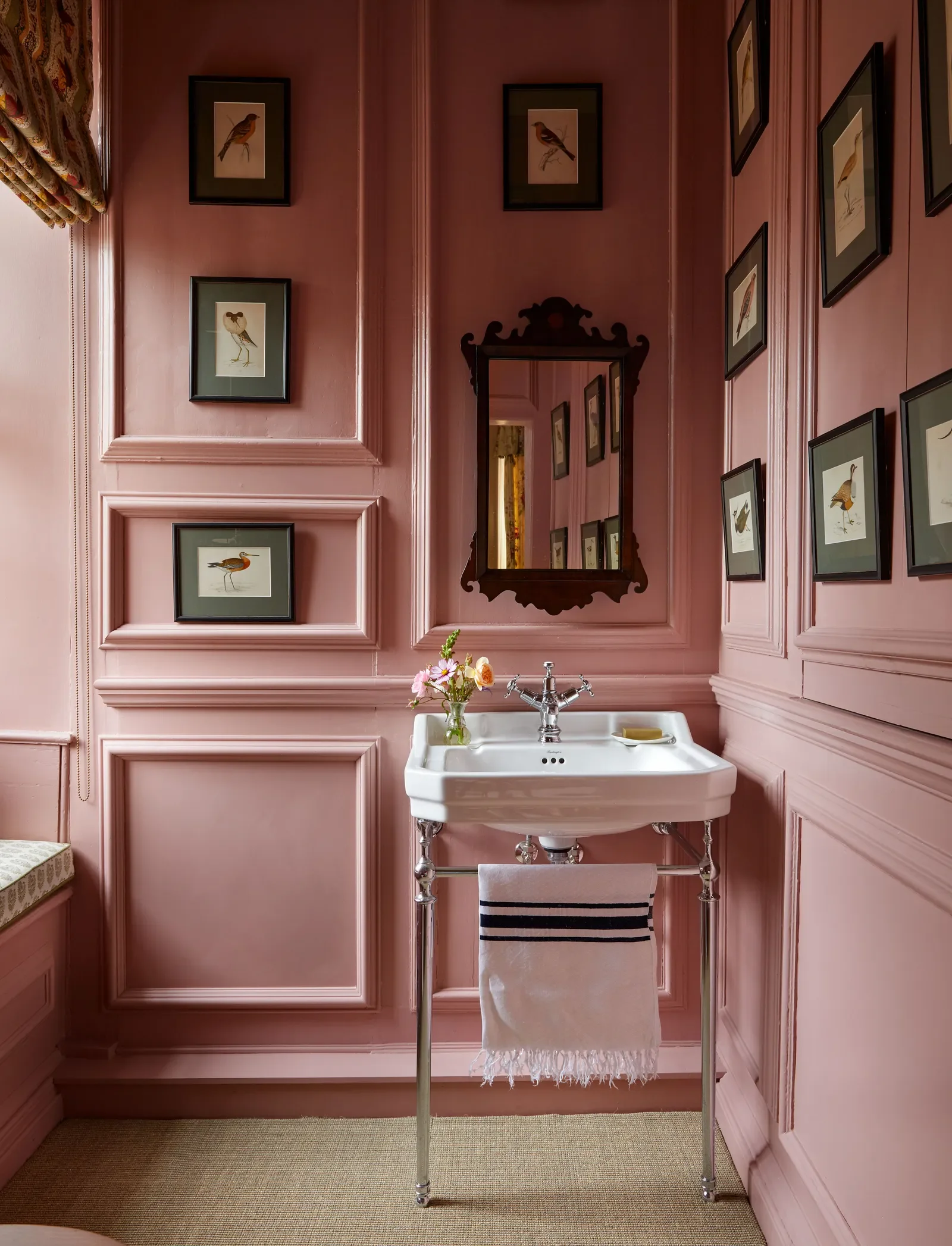
This bathroom pairs a dusty, muted rose with detailed millwork to frame an art collection, giving the small space a sense of depth and a luxurious feel.
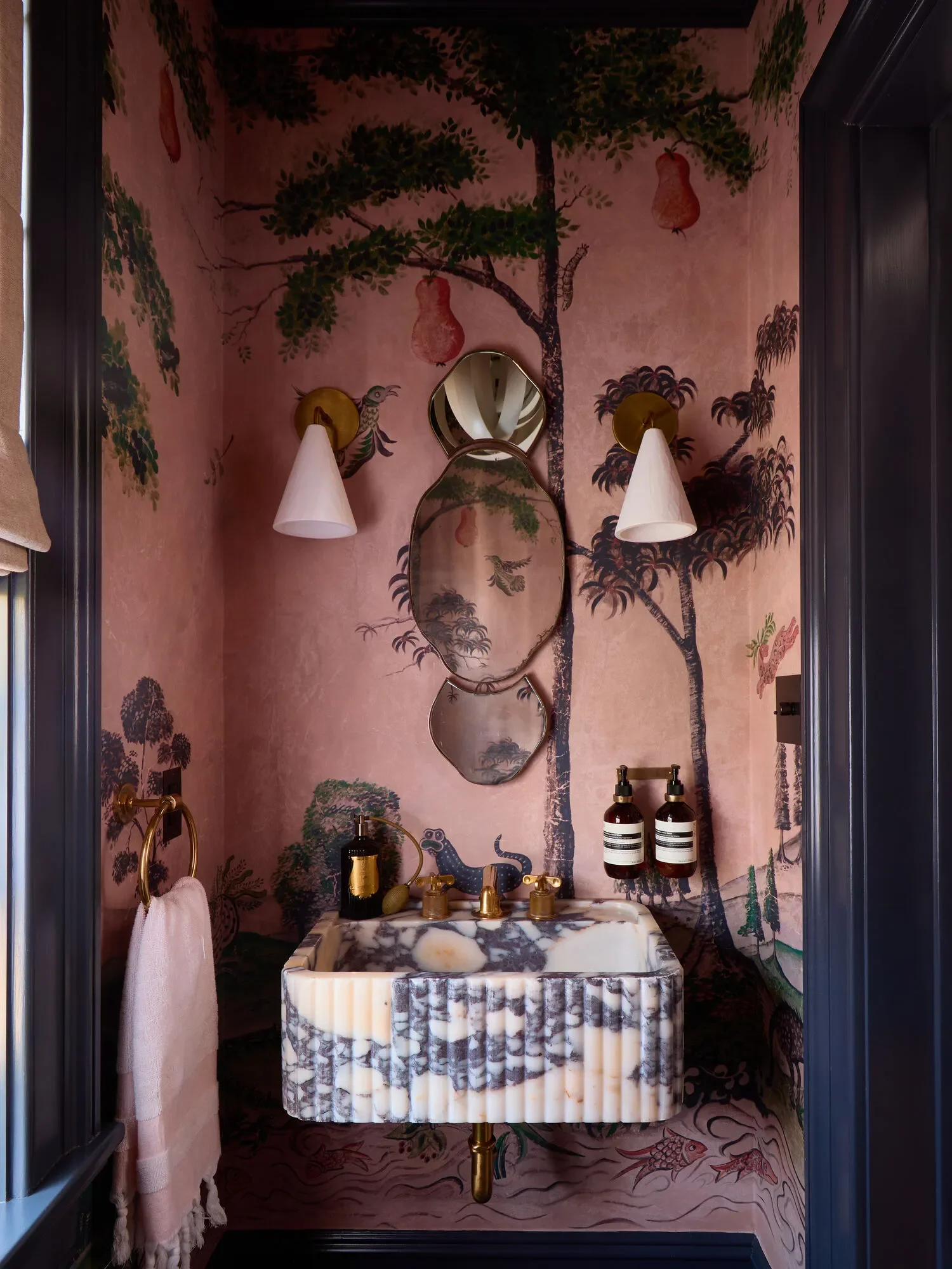
Carlos Garcia
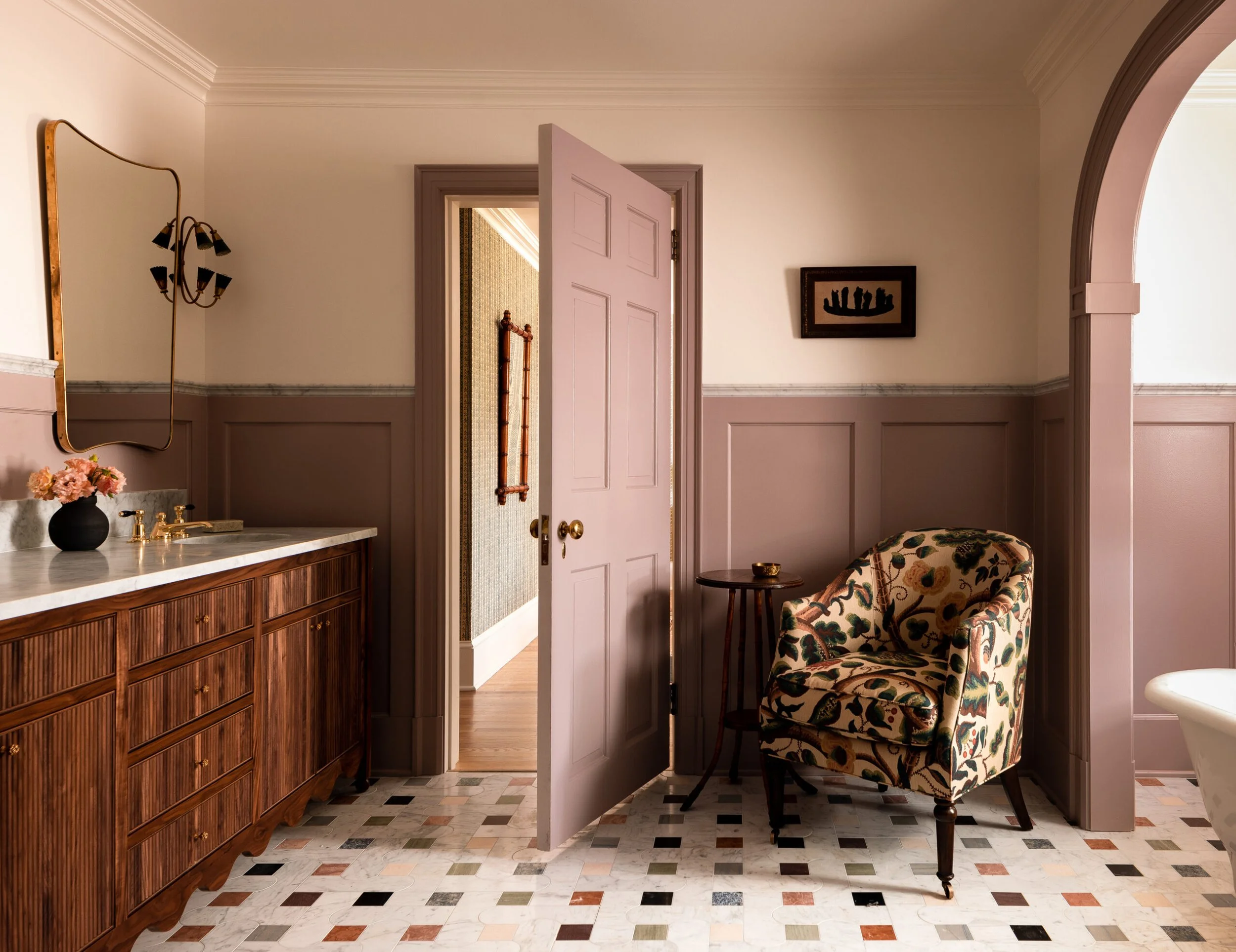
What I love most is how versatile the color is across room types. Dusty rose works just as well in a bedroom or living space as it does in a bathroom or hallway. Paired with dark woods, stone, brass, and muted companion colors, it feels layered and intentional.
Clément Vayssieres
Heidi Caillier
I also love how it’s used in this motif wall mural.
Saffron Case
After years of stark palettes and restrained interiors, dusty rose brings warmth and softness back into the home without feeling precious. It is expressive, but still grounded.
I recently used this tone in a nursery, and what stood out was not how sweet it felt for a baby, but how easily it will grow with the space. That balance is exactly what makes the color so compelling.
Five Dusty Rose Paint Colors I Love Right Now
Sulking Room Pink
A deep, complex pink with a generous dose of gray and earthiness. Sulking Room Pink reads more like a warm neutral than a traditional pink, shifting beautifully with the light and pairing effortlessly with stone, dark woods, and aged metals.
A warm, classic rose that feels decorative in the best way. This shade has enough depth to feel intentional while still reading soft and inviting. Especially lovely in nurseries or rooms with detailed millwork.
Muted and grounded with a slightly earthy undertone. Insightful Rose feels modern and versatile, working equally well in contemporary homes or more traditional interiors when paired with wood, stone, and warm metals.
A true dusty pink with softened saturation and a hint of gray. This is a gentle, approachable color that brings warmth without sweetness. Ideal for spaces where you want color to feel supportive rather than dominant.
A soft, atmospheric pink with gray undertones that reads almost neutral in low light. Peignoir feels calm and lived in, making it a beautiful choice for bedrooms, dressing rooms, or anywhere you want subtle warmth without overt color.