Why I Went Bold with Color in This Nursery
Most people play it safe when it comes to their home, and a nursery is no exception. It makes sense: nobody wants to redo a whole color scheme in two years, so pale and neutral feels like the safer bet. But a nursery is actually one of the easier rooms to be bold in. There's no old furniture it has to match, no resale value riding on the walls, just a blank room and a chance to try something you might not commit to anywhere else in the house.
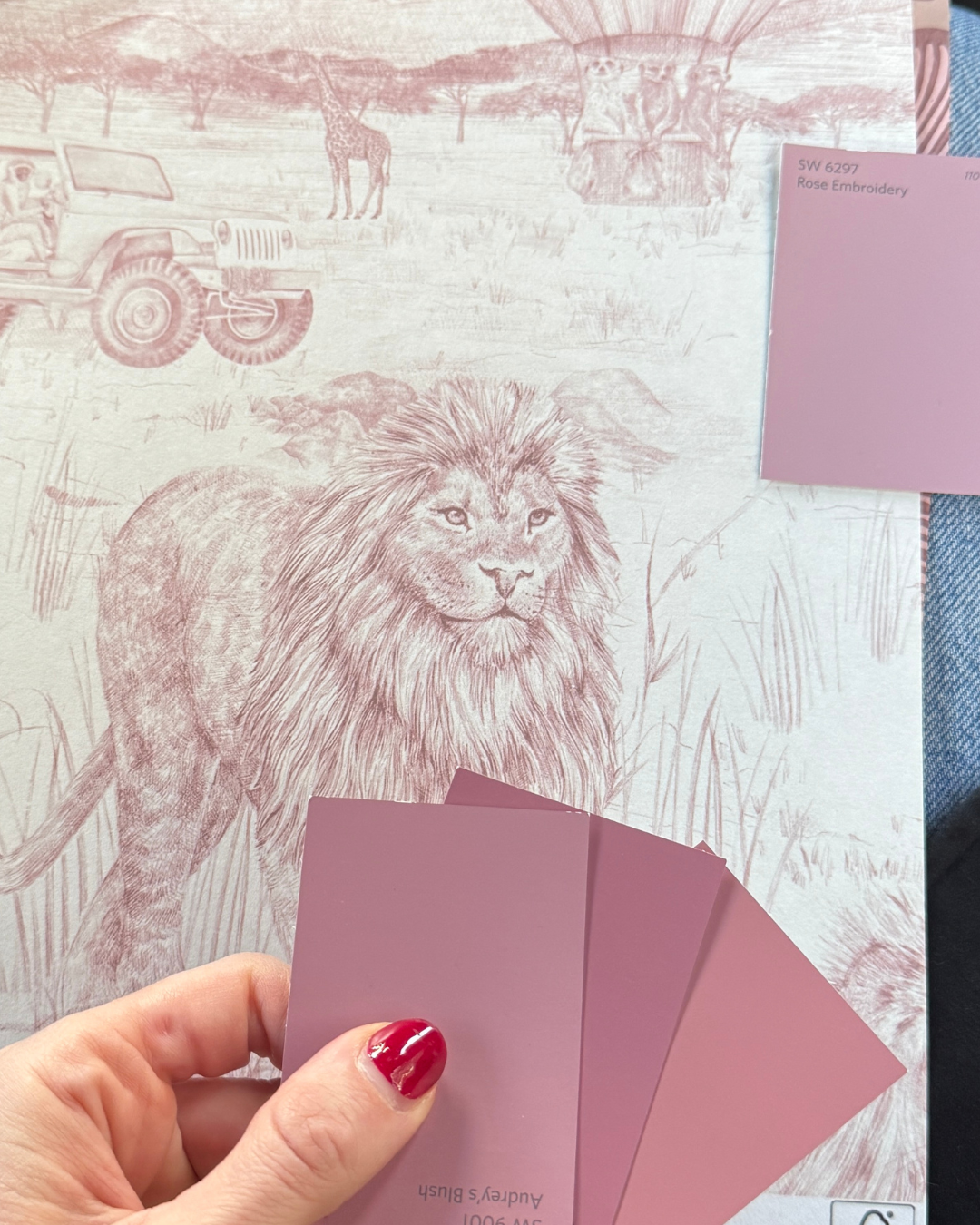
This nursery, in a West Village brownstone, is a case for taking that chance. I used a saturated dusty pink on the walls and kept the trim and ceiling white, so the room stays bold without feeling heavy. Natural wood furniture balances it out, keeping the color grounded instead of saccharine. It reads as a real color choice, not just a pink room for a baby.
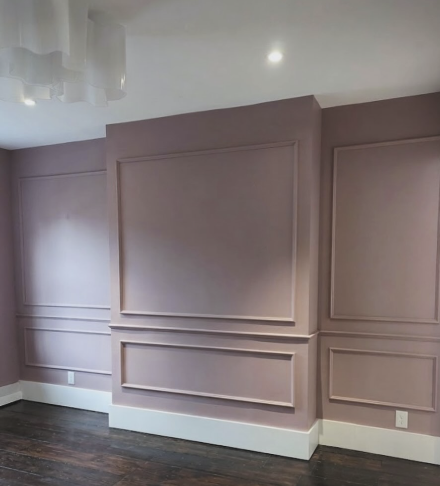
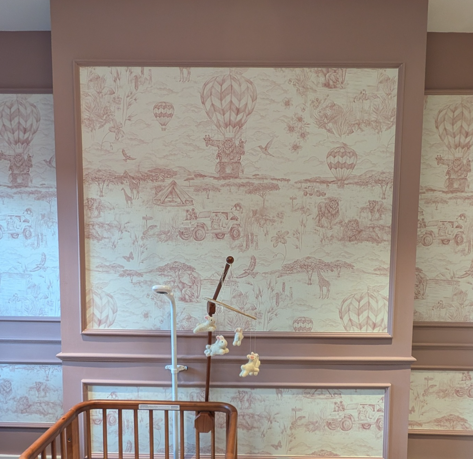
The room also had a quirk to work with. A non-working fireplace had left a bumped-out wall jutting into the space. Rather than build around it or hide it, I framed it in custom millwork and turned it into the focal point of the room with a hot air balloon and safari animal wallpaper I found from a British brand. What used to be an awkward leftover is now the first thing you see when you walk in.
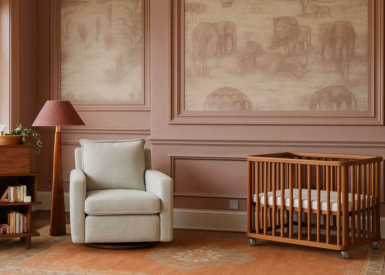
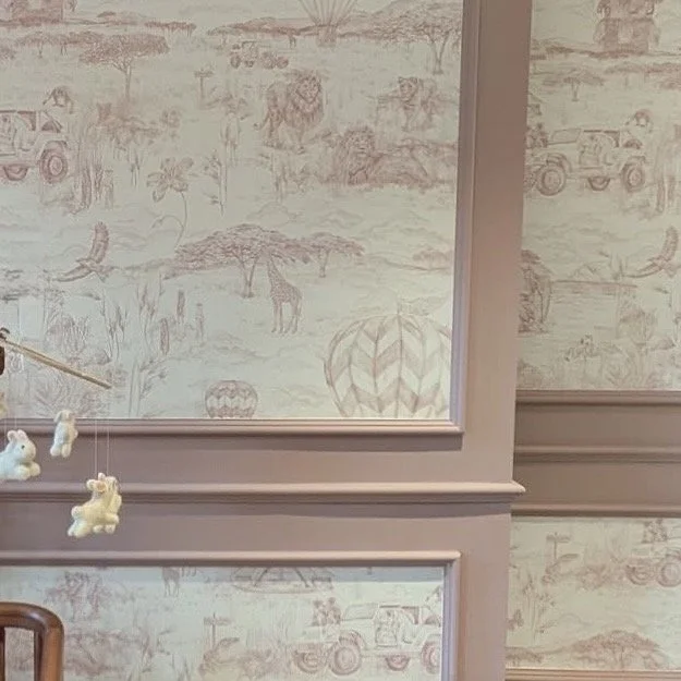
That split is really what makes the room work. The paint color feels mature and grown-up on its own, more like something you'd choose for yourself than for a baby. The wallpaper is where the fun lives, it's playful in a way the walls alone aren't. And the millwork gives the room some staying power: it's not going anywhere as the baby grows, even if the wallpaper eventually does.